
Guide to Create Interactive Drop Down Menu for Websites & Mobile Apps
The website interface is about dozens of elements partaking to build what is called “the user-friendly interface.” Mainly the interface consists of following four categories:
- Input Controls
- Navigation Components
- Informational Components
- Containers
Input Control comes first when it’s about setting up the foundation of a user-friendly interface.
Drop down menu designs are under-rated UI elements. The idea aims to synchronize the available options without making it look messy to the user. A common perception about the drop down menu is that it only focuses on responsiveness. But now this perception has changed a lot as more options and improvisations are doing the trick.
5 User-Friendly Drop Down Menu Designs Example
1- Facebook
The social media giant, Facebook takes credit as the most popular social media platform.
The user interface of Facebook has undergone several changes overtime to make it what it is today. Whether it’s the dark mode-feature or other layout changes, everything at Facebook proved to stand out as a user-friendly platform.
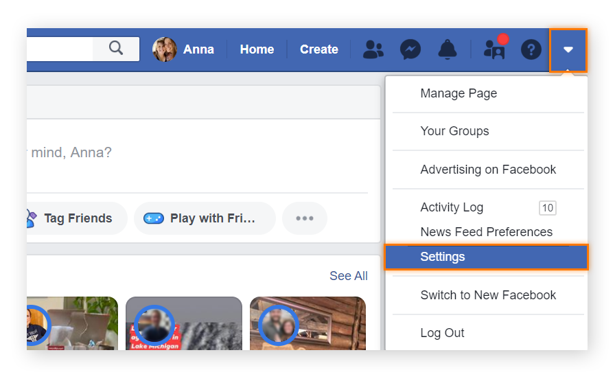
Even in terms of drop down menu design, Facebook is second to none. The attached screenshot shows how comprehensive yet simplified options are there in the dropdown to perform various activities on your favorite social media.
2- Lion Burger
Though it’s not one of the bigwigs, still Lion Burger manages to pull off a fascinating drop down, which connotes overall brand colors on the website. If you hover over ‘our work’ tab on the menu bar, it flawlessly shows a drop-down menu right there. Apart from its interactive color display, the button-like display feature of the available options looks an exciting option to explore.

3- Porsche
You loved their fancy cars, right? You will surely fall in love with the Porsche website’s drop down design. It features all the classy cars with Cayenne on the left. They seemed to display a side pose of their most-wanted cars right away for those visiting the website.

Furthermore, as soon as you hover over these available options, it offers a dropdown menu with photos and other feature options of the car right on the front.
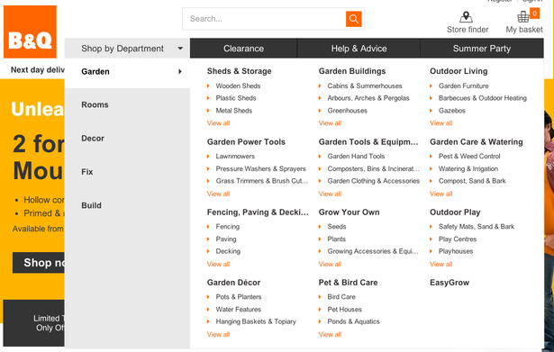
4- B&Q
Less is more when it comes to drop down menu designs. Though it’s not a hard-and-fast rule to follow when setting up these interface elements. B&Q as a shopping website defies the odds of putting lesser options on the drop down menus as all the 10 options on the menu bar further results in dozens of options. What makes this drop down too good to talk about is the presentation of piles of data in the best manner.
5- TN Vacation
Gone are the days when responsive drop down menus were the only thing required for website optimization purposes. The drop down menu of this website highlights how minimalist and improvised designs can also win hearts. The black background and white fonts look eye-catching. What looks even better than that is the water stream showcased in the background. Consequently, all this tells how you can create themed drop drowns to make them look more interactive.

Final Say
Drop Down Menu designs can enhance your website’s UI presentation, no matter if it’s your service website or a personal blog.
As the drop down menu is closely associated with navigation, one simple trick is to keep it simple and clean.
Still, if you’re keen on adding your own colors, count on reliable UI services providers to get over the line.