How Significant is Dark Mode in UI? Read The Tips to Know
Have you ever experienced dark mode? Did you like it or did you not like it? If not, you are lacking great reading experience in your apps. Dark mode UI is one most popular feature of the user interface design these days. We still remember the excitement we got when we switched our skype to dark mode. We became literally obsessed with it.
People who spend a lot of time on screens utilize the Dark mode theme to enhance their readability and use it as a light repellent. Dark mode UI became popular among smartphones and new web applications because it makes foreground content stand against the shaded background.
For those who have not experienced it, dark mode UI is a night-friendly theme that only uses a dimmed/grey color so that your eyes are less burdened. And those who have experienced it, does dark color attract you?
The Significance of Dark Mode UI
Dark theme is an efficient move to market your UI among other competitors and enhance your brand visuals within a few days. The most frequently known and scientific benefit of dark mode UI is that it preserves energy intake on devices with OLED or AMOLED displays. Using it is considered beneficial because it’s lighter on the eyes than a stark, bright white screen. But, is dark mode better for UI? Let’s learn.
The following are some major benefits that ensure Dark UI design is significant if used:
1) Battery Efficient
The Dark UI design acts as a battery savior because it consumes less light and maintains every app. According to Google, using dark mode on OLED screens gives your battery a good life.
For example:
Maintaining your screen brightness at 100% saves 60% of screen energy. Both iPhone and Android rely on OLED screens and use a darker UI that gives you efficient battery consumption.
2) Improves Health and Well-being
Did you know that blue light exposure is not healthy for your eyes? If not, here’s how you can improve your health with the use of dark mode UI.
Dark UI design at night helps you get a quick sleep and you stay asleep for a longer period.
In theoretical terms, it is mentioned that the use of default screen settings exposes a greater way of blue light after dark that disrupts your circadian rhythm while suppressing melatonin. It is a hormone that initiates a message to your body that it’s bedtime.
The following are some other benefits of dark mode for your health maintenance:
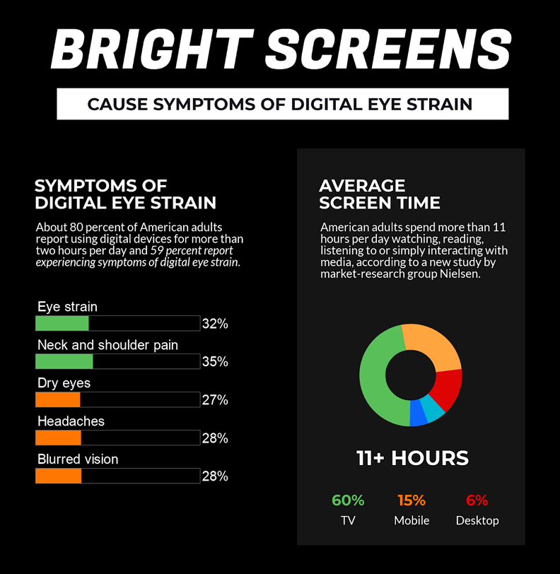
- Dark mode reduces eye strain
- Dark mode cut downs blue light exposure
- It decreases the chances of insomnia, headaches, or neck pain
- Higher levels of melatonin decrease the risk of obesity and cancers
3) Enhance Visual Representation of Your App
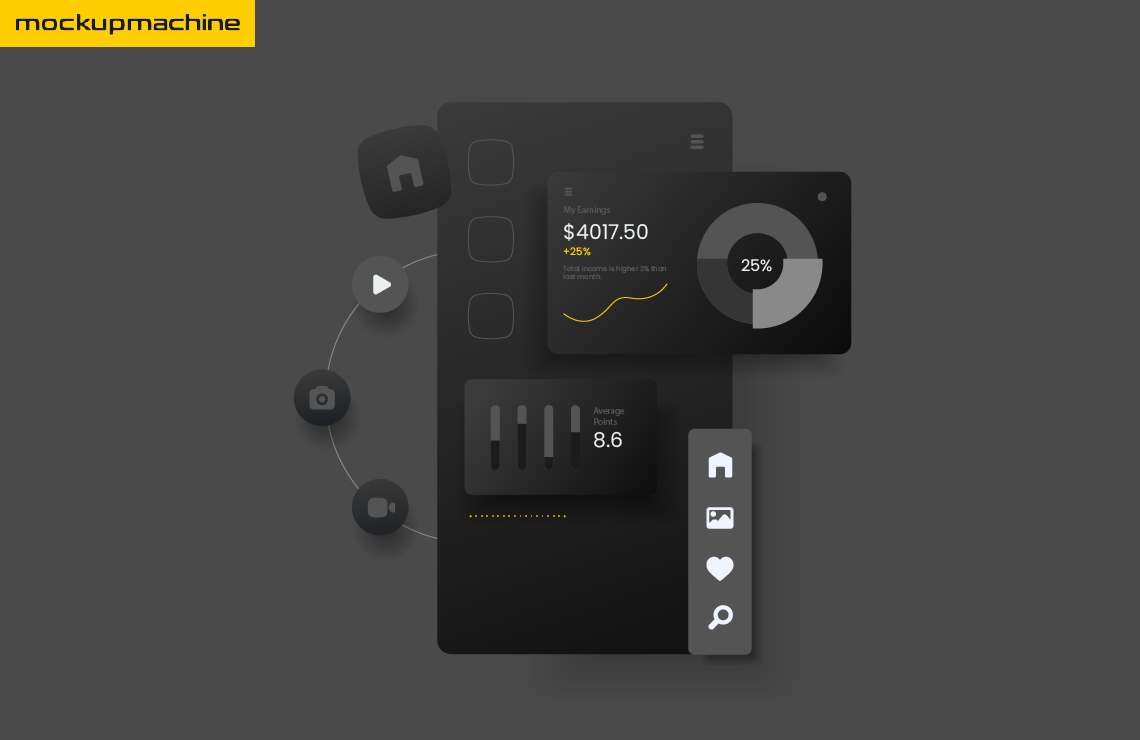
No one can disagree with the fact that Dark Mode UI enhances the visual representation of an application. The use of dark mode offers great opportunities to present graphic content that includes graphs, pictures, dashboards, and photos to you.
For example:
We are showing a representation of Dark UI design in different apps:
What Are The Major Applications that Support Dark Mode?
Below are some comprehensive applications, OS, chat services, browsers, etc that support dark mode. Take a look:
| Operating System | Browsers | Chat Services | Social Media | Productivity Tools |
| Windows 10 Mac OS Mojave Android IOS 13 | Google Chrome Safari Mozilla Firefox Opera | Facebook Messenger Discord Skype Slack | Twitter | Notion Trello Todoist |
What Are The Best Practices to Build Dark UI Design?
Here are a few practices that assist you with designing Dark UI design:
1- Plan the use of color in your app
Use pure black background for dark mode and ensure to dim your text slightly. Pure white allows your eyes to absorb more light and the font to bleed with the background which causes the text to blur.
2- Brand your dark color
Try not to use an ordinary version of dark color but make it prominent and distinctive; it is efficient to use a unique one. So, combine your color fonts to visualize them prominently.
3- Reduce color saturation
Try to avoid saturated colors in dark mode, and use low saturation to mute the versions of primary colors for effective performance.
4- Balance your Dark mode contrast
There are a few plugins that inspect an appropriate color contrast for your audience.
Below are a few tools to double-check the contrast ratio:
- Stark (Sketch, Figma, and XD Plugin)
- A11y (Figma plugin)
- Contrast (Figma plugin)
Conclusion
Try to consult the tips mentioned above with an expert to boost your application in the market with the use of Dark Mode UI.
Dark UI design benefits your application. It saves your battery while you are enjoying memes and watching videos in a dark atmosphere.
If you are planning to install the Dark Mode UI in your application, consult us now. mockup machine is a professional platform with an experienced team of UI/UX experts that can manage various types of mobile applications and web designs for you. We can even help you choose the best dark shade in the form of mockups.